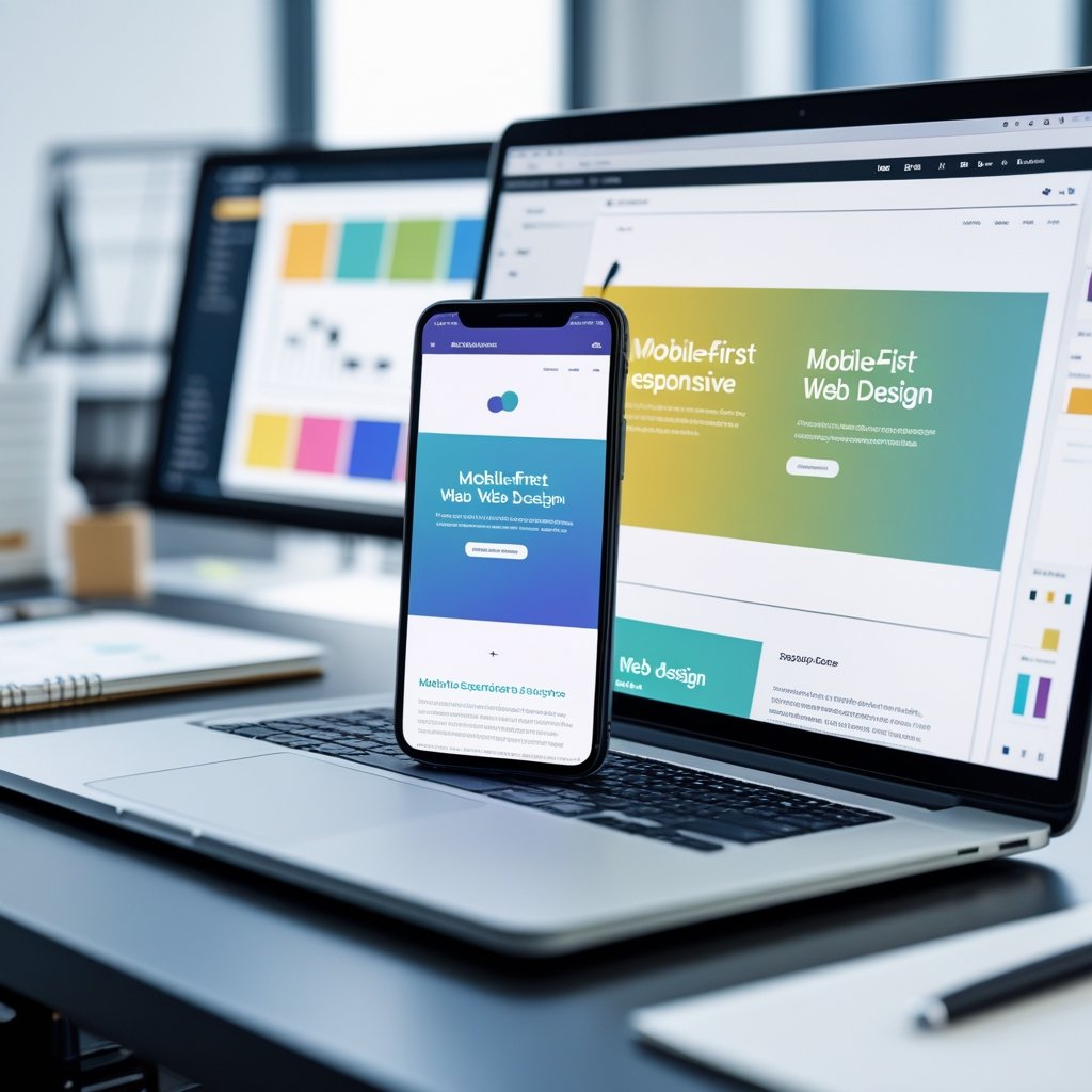
Designing for mobile devices is no longer optional—it’s the foundation of modern web development. Mobile‑first design means building websites that work seamlessly on small screens before adapting them for larger ones, ensuring speed, clarity, and accessibility from the start. By focusing on what matters most to mobile users, we create experiences that feel natural and effortless across every device.
We live in a world where most digital interactions begin on a phone. Adopting a mobile‑first approach allows us to meet people where they already are while improving performance, usability, and engagement. It challenges us to prioritize essential elements, simplify navigation, and design layouts that scale gracefully as screens grow.
In this post, we’ll explore the key principles that define effective mobile‑first design and answer common questions that help turn theory into practical technique. Through clear strategies and tested methods, we can build websites prepared for today’s mobile‑driven landscape.
Essential Principles of Mobile-First Design

Effective mobile-first design relies on building from the smallest screens upward, focusing on usability, clarity, and performance from the start. By emphasizing content priority, progressive enhancement, and accessibility, we ensure that every user—regardless of device—experiences a consistent and efficient interface.
Defining the Mobile-First Approach
A mobile-first approach begins with designing for mobile devices before scaling up to tablets and desktops. We plan layouts, navigation, and interactions around the constraints and behavior patterns of mobile users, which helps us identify essential functionality early.
This strategy encourages simplicity and clarity because smaller screens allow limited space for content. When we design within these limits, we create more focused interfaces and avoid unnecessary visual clutter. Mobile-first design also aligns with responsive design principles by allowing layouts to expand adaptively using CSS media queries.
The result is a progressive and scalable structure where each design layer adds functionality instead of removing it. By prioritizing mobile devices first, we build a foundation that enhances usability and ensures consistency across all screen sizes.
Prioritizing Content for Mobile Users
When adopting mobile-first design principles, we must decide which information or actions matter most to mobile users. Prioritizing content means understanding their goals, such as quick navigation, immediate access to key features, and faster load times.
We can structure our hierarchy visually:
| Priority Level | Content Type | Design Goal |
|---|---|---|
| High | Core functionality (navigation, CTAs) | Make visible above the fold |
| Medium | Supporting information | Show after critical content |
| Low | Secondary elements | Defer or hide behind interactions |
By giving primary elements prominence and minimizing distractions, we improve readability and interaction flow. Designers should ensure that content layout follows a clear order and that text, buttons, and images remain legible without zooming.
This deliberate structuring creates a user-centered experience that respects both device limitations and user expectations.
Progressive Enhancement in Web Design
Progressive enhancement complements the mobile-first approach by layering complexity only when needed. We begin with a base experience that functions on any browser or connection, then add enhancements for more capable devices.
This technique includes adding richer visuals, animations, or interactive components as users move from mobile to desktop. Rather than degrading larger-screen experiences, it enhances them progressively while keeping the core accessible to all users.
For example:
- Base layer: HTML structure and essential content
- Enhancement layer: CSS styling for responsive layouts
- Advanced layer: JavaScript for interactivity
Applying this model ensures operational reliability and adapts efficiently to different platforms. It helps designers build flexible and maintainable codebases that perform well across diverse conditions.
Performance and Accessibility Considerations
Performance and accessibility play critical roles in mobile-first web design. A site that loads quickly and works reliably improves mobile user experience and search visibility. We can optimize performance through image compression, efficient CSS, and asynchronous loading of scripts.
Accessibility ensures that all users, including those with disabilities, can navigate our designs. Scalable typography, sufficient contrast ratios, and support for keyboard or screen-reader navigation help maintain inclusivity.
We should test across devices and browsers to identify issues early. Lightweight, accessible code often leads to better performance, so both priorities reinforce each other. When we integrate these factors from the start, we create interfaces that are not only visually responsive but also technically robust and user-friendly.
Frequently Asked Questions

We focus on the practical aspects of mobile-first design, including design principles, implementation techniques, and its relationship to responsive design. We also cover the measurable advantages of this approach and identify useful sources of inspiration for well-executed mobile-first websites.
What are the key principles of mobile-first design?
We begin with the smallest screen size and ensure the layout performs efficiently before scaling up. This process emphasizes content prioritization, progressive enhancement, and responsive layouts.
Touch-friendly interaction, readable typography, and optimized loading speed all serve as guiding principles. These fundamentals help us maintain usability no matter the device or connection quality.
Can you give examples of best practices for implementing mobile-first design?
We simplify navigation by using clear menus and visible call-to-action buttons. We limit visual clutter, keep critical content near the top, and design interfaces that accommodate one-handed use.
Testing on real mobile devices helps verify usability under real-world conditions. We also apply lightweight images, compressed scripts, and consistent spacing to preserve performance.
How does mobile-first design differ from responsive design?
Mobile-first design starts with the constraints of mobile devices and then adds complexity for larger screens. Responsive design, while similar, typically adapts an existing layout to different viewports using flexible grids and media queries.
By focusing on mobile users first, we ensure performance and usability take priority before adjusting anything for desktops or tablets.
What are the benefits of adopting a mobile-first strategy in web development?
A mobile-first approach leads to faster page load times, streamlined content structure, and better accessibility. Because search engines favor mobile-optimized sites, it also supports stronger SEO performance.
By resolving mobile usability issues early, we reduce redesign costs and future maintenance needs. The result is a scalable, adaptable website ready for any device.
Which techniques should be used for effective mobile-first responsive design?
We rely on fluid grid systems, flexible imagery, and CSS media queries that build upward from mobile breakpoints. This ensures consistent behavior across varying screen widths.
Progressive enhancement and modular CSS help us extend functionality smoothly without breaking the mobile experience. Using performance audits and monitoring tools also keeps the design efficient as it grows.
Where can I find inspiration for mobile-first website design?
We can review examples from companies known for minimal, user-centered mobile interfaces—such as Airbnb, Dropbox, and Slack. Their designs emphasize speed, clarity, and accessibility.
Design communities and showcase platforms like Dribbble, Behance, and Awwwards provide additional real-world examples. Studying these resources helps refine our understanding of effective mobile-first execution.